Web Design for All
Landscape Designers and Planners Communicating in a Digital World


A little over a year ago I was sitting with my MacBook scouring the web for job postings, networking opportunities, anything that might lead to my first job out of design school. First impressions of design offices were framed when the homepages of their websites would load for the first time. This is how most of us search for anything: the web. A website can tell the story of an office and actively stream their news to the public like never before. I have since been lucky enough to join a team of landscape designers and planners, and as it turns out, our office’s website was due for a refresh. Rather than collecting all of our landscape drawings and photographs, throwing them at a web developer, and saying a prayer, we gathered a small team and applied our graphic design skills to a new process: web design. Throughout this six-month investigative process, we did not become web design experts, but discovered effective ways to communicate the story of a design office by creating a thoughtful and attractive website.
As designers, the way we communicate our craft and identity to the rest of the world has changed dramatically over the past ten years. Rapid progression in web design and social media has created dynamic platforms for conveying our ideas, our work, and our vision in clear, simple, and beautiful ways. Rhodeside & Harwell is a collaboration of landscape architects, planners, and urban designers cultivating relationships between land and people. The story of who we are, how we think, and what we create, is being retold through our new website and blog. The framework, contents, and interface of these sites have been reconstructed from the ground up, to better tell our story.
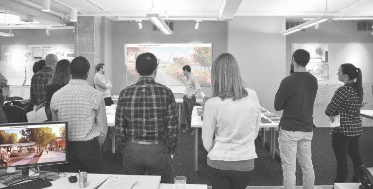
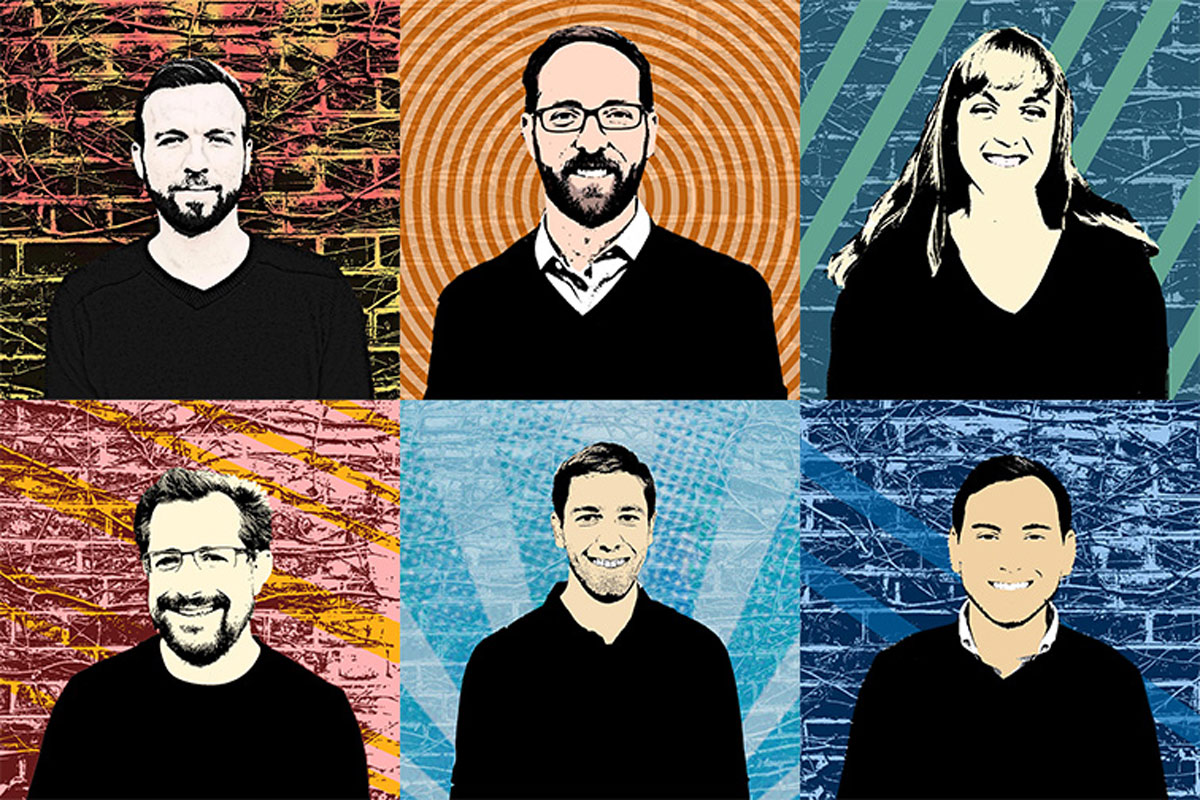
a collaborative team
While we may not be web designers or developers, we thought it would be valuable to lead the design of our new website and blog to more authentically communicate our message. Conceptualizing and laying out the sites and their pages was our focus, but we needed a web designer and developer to build our visual ideas, through coding languages, into a real, live website. For our office’s primary website we collaborated with Sean Brodbeck, and for the Plan.Place blog website we collaborated with Elliot Glass. Both were critical in lending their web design and development expertise, while patiently allowing us the freedom to explore different site frameworks and aesthetics. Our ‘inside’ understanding of our office’s character and style combined with their technical expertise in website creation cultivated a simple and attractive design language.
an investigative process
Design terminology tends to be cross-disciplinary, shedding light on technical and theoretical aspects that may not be clearly understood otherwise. Web and graphic design is quite similar to landscape architecture, planning, and urban design when we think about the design process in terms of a foundational structure, a set of rules and underlying theory, and a resulting aesthetic or graphic style. Our final product happened to be a dynamic digital interface, requiring clear organization and even clearer wayfinding. For us, the underlying idea was simple: we sought minimal, but clearly understood text and page layouts, allowing images and graphics to tell the story. At moments, we would get so carried away with animations or interactive gestures that it would blur the primary focus of that page. All the bells and whistles can be tempting, but at what cost to the clarity of a message? As it turns out, simplicity in structure and aesthetic has its perks in more ways than one. We learned more about the dynamic tendencies of a webpage, and it became obvious that embracing simple, grid-based page layouts would benefit the webpages tremendously when viewed on various screen sizes and devices.
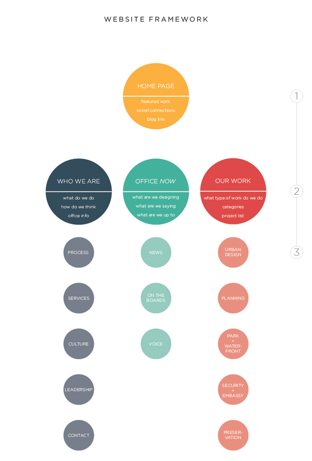
For our design and planning work, Adobe InDesign is the standard page layout software for both digital and print documents. So, naturally this is what we favored for mocking up webpage layouts and communicating them with Sean and Elliot. One slight problem: an 11×17-inch formatted master plan report never arbitrarily morphs into some obscure 9.5×13.2-inch format after you hand it to your client, but a webpage does! Its height-to-width ratio morphs endlessly depending on whether it is viewed on a huge 60-inch widescreen, a handy tablet, or an even smaller smartphone. Needless to say, static InDesign page mock ups were good for conveying design ideas, but a bit inadequate when applied to the responsive environments for online viewing. Our webpage layouts began to develop more as a compatible family once we saw them come to life through a beta website. Still, communication of InDesign mock ups at a standard screen size pixel ratio was useful, but Sean and Elliot continuously updating the beta site allowed us to see the nuances of a dynamic, living webpage. What works. What does not. This learning curve narrowed our design focus to ultimately create a more versatile product for desktop and mobile viewers.

where’s the filling?
The collaborative work to create a clearly organized, easily navigable, and visually appealing website would have left us dead in the water without some quality content to fill it out. The content for the websites was as important as the layout it got plugged into. From the homepage to an archive of thumbnail images, the graphics chosen for each page had a specific purpose and certain size parameters. This not only made the subject matter of a particular image important in context to the rest of the site, but the visual focus of the image needed to fit the ratio of its given frame, and sometimes an endlessly morphing ratio in the case of full-page images. In line with the old saying, a picture tells a thousand words, we made the decision to minimize text across the primary website in hopes of telling the story of our office and our work through more thoughtful, visually enticing images. And let’s be honest: if you’ve made it this far, you are one of the few spending more than twenty seconds reading one thing on the web.
On the flip side, Plan.Place is a platform for our team to express their opinions and write thoughtfully. The blog is an evolving collection of content, which is not as closely curated as the primary website, and focuses more on text to communicate ideas. The images are there to support and enhance the written ideas, and to present an introductory visual hook for each article. The content being generated for the blog is organically growing from individuals’ passions for design, planning, creativity, daily life, art and anything else that might affect the world around us. Although they are two distinct websites, Rhodeside & Harwell.com and Plan.Place have become the digital voices to tell the story of our work and the collaborative group of people behind it.
A story can be told many different ways, so communicating ours authentically was important for the new website and blog. Whether it is a large, lovely image on a homepage or a thoughtful paragraph of text in a blog article, it is all contributing to an evolving story of creative minds dedicated to their craft. Rhodeside & Harwell.com and Plan.Place are not static words printed on paper, but dynamic digital tools. They are a peek into our minds, an evolving exhibition of our work, and a way for us to connect with you.
July 7, 2015
Comments